
I have a habit of holding my breath when I look at Lyza.com as it was in 2010. As if these pages would go to dust if I exhaled on them. I'd done the content genesis for years; now I gave it a lavish coat of finery.
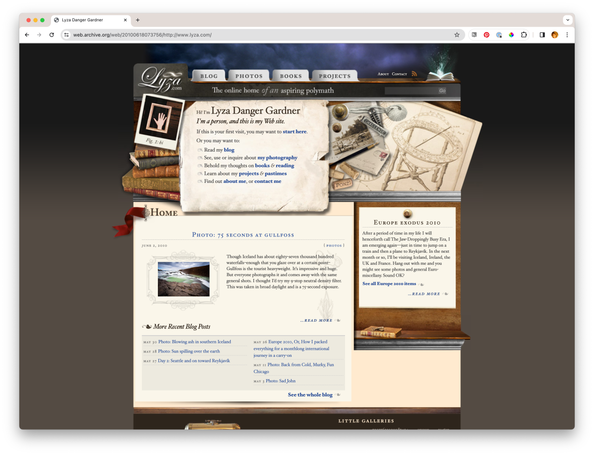
The salad days, Lyza.com, early 2010
In retrospect, I think I got it right. I certainly tried hard enough:
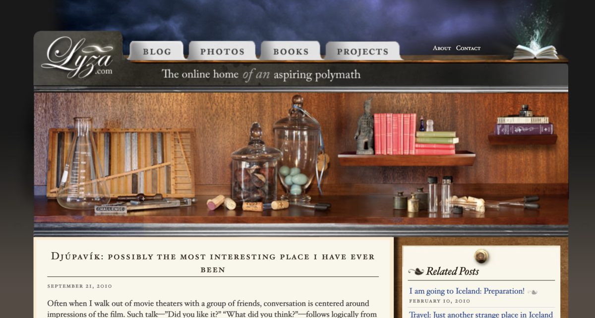
...building and editing the photo illustrations throughout the site took me an estimated 100 hours... Nearly all of the items you’ll see in the images as you bop around the site are photos of objects in my home that I have some attachment to: books, anachronistic tools, papers, brass weights, engravings from old books, knick knacks and rocks.
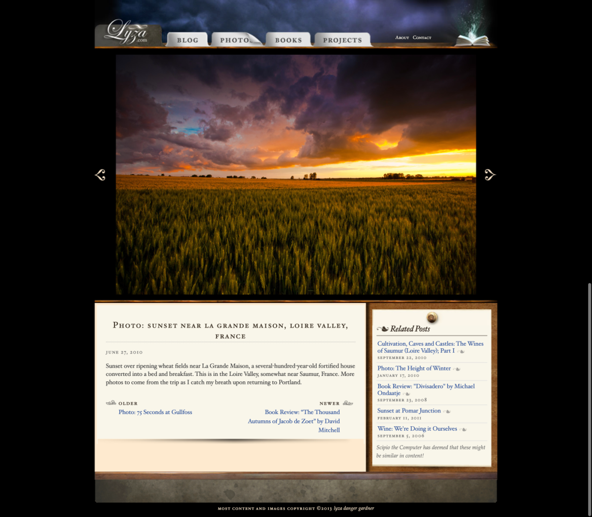
I built exactly the site I wanted, for exactly that time. I went full deep, developing my own plugins for data retrieval and caching from remote APIs; photo galleries, photo posts, photos photos photos. The presentational reinvention of my site coincided with my acquisition of the new-at-the-time Canon EOS 5D digital SLR, which was a phenomenal, revolutionary camera (and I dislike the word revolutionary). This was when I finally finished my long, griefed transition away from 35mm film (Fuji Velvia 50ISO reversal film was my go-to beforehand). I was photo-drunk. It shows.
I indulged my then-current letterpress obsession by getting very persnickety about an all-Caslon font stack — system fonts only, though — achingly crafting tabular layouts and bulleting with fleurons. I was emulating Robert Bringhurst’s Elements of Typographic Style.
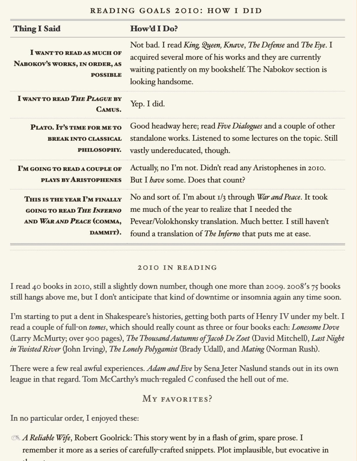
A detail of a post about books shows the depth of absurd typography I went to. I still get prickles from Caslon’s italics.
Would I do it differently now? Barely. I wouldn’t use that weird “magic book” image on the right side of the header[1], nor the creepy and self-worshipful analemma-halo thingy, and I’d take more care with the size and contrast of the navigation items. I wouldn’t use the BluePrint CSS framework or jQuery or CSS sprites, not because there was anything wrong with those tools at the time, but because the web is more better now and we don’t need them anymore. I wouldn’t use WordPress now, or really anything that shatters my content around a relational database, but that’s not a knock on WordPress, it’s just personal choice.
In my lookback this week, I assumed all of this visual faffery would cost, that my site then would have been a blue whale of a performance turd, but it looks like I did this:
The site, while visually intensive, scores an A on Yahoo!’s YSlow scale. To achieve this I’ve focused on GZIPping content, concatenating and compressing JavaScript, using CSS sprites and other tactics to improve performance.
Lest this entry in this series feel excessively self-contratulatory, the Beautiful Years didn’t last. Within 18 months a permafrost had set in that would mark the end of my life as a fretlessly public person. Forever.
Oddly, that was the one image of just a few that weren't my own used in the design that I paid for; apparently I bought it from iStockPhoto. ↩︎